Elizabeth | E-com LP Designer & Developer @ElizzyBuilds
I design + build high-converting landing pages for e-commerce brands. Figma → Replo | UX + CRO . DM NOW → https://t.co/gvSAMEm8jL linktr.ee/ElizabethTech Ibadan, Nigeria Joined February 2025-
Tweets130
-
Followers361
-
Following3K
-
Likes5K
Not every landing page needs to shout to get attention. Sometimes, the right imagery, the right pacing, and a clear story are enough. Here's how I brought STORMROCK's experience together from top to bottom.
You have the idea. You know what you want to build. You can even explain it perfectly to your team. Then you open Figma... And suddenly, none of it makes sense on a screen. That's exactly why wireframes matter. They turn the conversation from: “Does this look good?” into: “Will this actually convert?” That's a much better conversation to have early.
I kept looking at this page and asking myself: “If I were the customer, what would I still want to know?” That question changed how I approached the redesign. I reworked the experience around the information that actually helps someone make a confident choice. Before and After Redesigned @figma #Webdesign #ecommerce #CRO
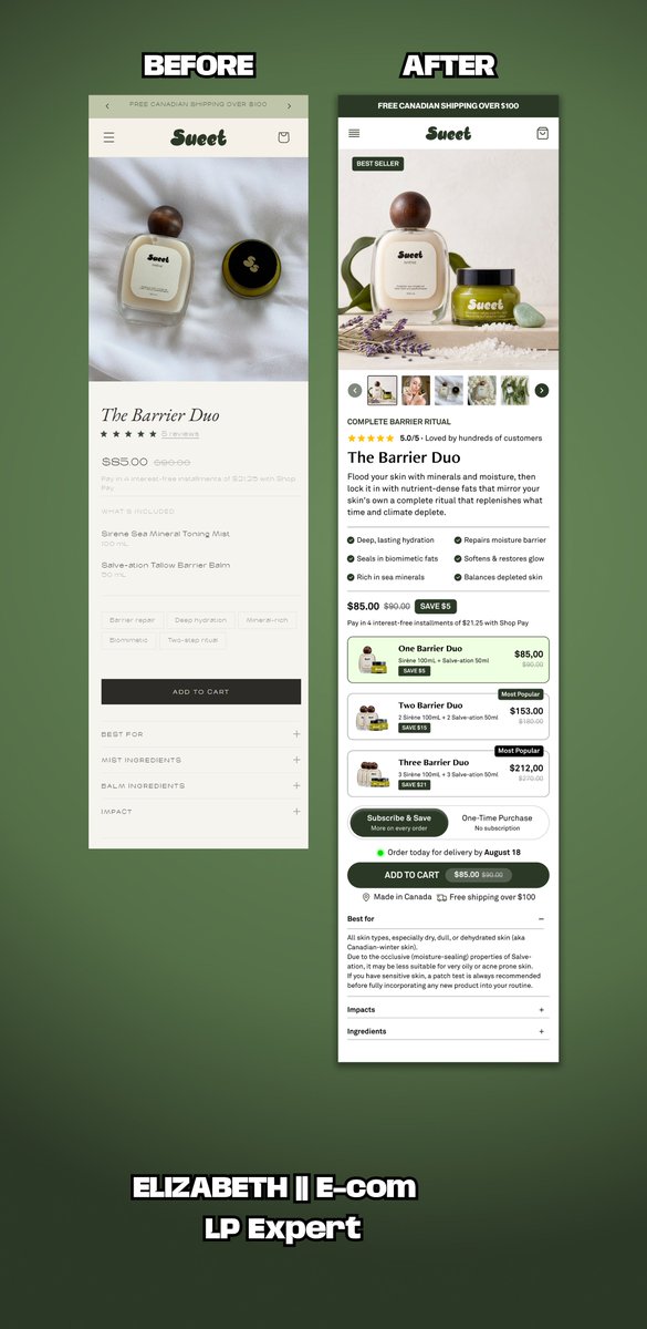
Looking back at this project, one thing stands out: A buy box isn't just where people purchase. It's where they decide whether they trust the product enough to buy. Every redesign reminds me that small UX decisions can have a big impact on the overall buying experience.
The "Buybox" is the most expensive real estate on your website. If it isn't converting, nothing else matters. Here is how I designed the Kennies buybox section @figma #Figma #Landingpage #Replo #UIUXDesign #Ecommerce

One thing I've learned while designing landing pages: A beautiful interface can't fix a weak page structure. Before I touch colors or typography, I focus on the customer journey. Every section needs a purpose. Every scroll should answer a question. Every CTA should feel like the natural next step. This is the planning stage behind a homepage I recently designed.
Yesterday I shared a buy box concept. Here's what inspired it. I kept looking at the original experience and felt the buying journey could be simpler. Not because it looked bad... But because there were opportunities to make the decision easier for the customer. Here's the before and after. The goal wasn't a prettier interface. It was a better buying experience. Which version feels easier to shop from?

Buy boxes are one of the most overlooked sections on a product page. They're not just where customers click "Add to Cart." They're where customers decide whether they trust your product enough to buy. I spent some time exploring a cleaner buy box concept focused on: • Better

Buy boxes are one of the most overlooked sections on a product page. They're not just where customers click "Add to Cart." They're where customers decide whether they trust your product enough to buy. I spent some time exploring a cleaner buy box concept focused on: • Better product storytelling • Clearer purchase options • Stronger buying confidence • A smoother mobile experience Curious... What's the first thing you look for in a buy box?
Before → After I challenged myself to redesign this hero section with one goal: Make the value proposition clearer and reduce friction above the fold. Here's what I changed: • Simplified the visual hierarchy • Brought key benefits closer to the CTA • Improved readability for mobile users • Created a cleaner path from first impression to action Every design decision should make it easier for someone to say "yes." Designed @figma .

Mobile isn't just a smaller version of desktop. it's where the customer journey begins for most DTC brands. This advertorial was designed with a clear reading hierarchy, intentional pacing, and strategic CTA placement to keep users engaged from the first section to the final offer. Here's the full mobile walkthrough.
This is the kind of ecommerce design I enjoy building most. Advertorial-style pages that: • grab attention fast • build trust naturally • educate while selling • keep users engaged longer Built in Replo for Goldielocks brand. #cro #ecommerce #replo
Following up on the desktop version I shared earlier. This is how the advertorial looks on mobile. I spent a lot of time making sure the spacing, hierarchy, and reading flow felt natural from top to bottom. Simple, clean, and built with conversions in mind.
June is here, and I'm already shipping. Just finished designing this advertorial page in Figma for a health product brand. The goal wasn't to make it "look nice." The goal was to: • Stop the scroll • Build trust • Increase conversions • Drive sales That's the difference
One thing I always keep in mind when building landing pages... If it only looks good on desktop, it's not finished. Most of your customers' purchases start on mobile. Which means every section, every headline, and every CTA has to feel effortless on a smaller screen. Mobile view for Bubble #Replo #Ecommerce #Shopify
One thing I enjoy about building advertorial pages is figuring out how to keep visitors engaged. Not for 5 seconds. Not for 10 seconds. But long enough to understand the value of the offer. Every section, headline, and image has a job: Turning curiosity into attention, attention
One expensive mistake I keep seeing: Brands spend thousands driving traffic with great ads... ➡️ Then send people to a product page that expects complete strangers to trust them in 5 seconds. If a visitor lands on your page and their first thought is, "Why should I believe this?" ...the page has already lost. Good advertorials don't just sell a product. They educate, build trust, answer objections, and create belief before asking for the sale. That's why I built this one @replohq Because sometimes the highest-converting page isn't your product page... It's the page that convinces people your product is worth buying in the first place.
Your product page shouldn't have to do all the heavy lifting. Cold traffic needs context. It needs proof. It needs a reason to trust you before they're ready to buy. That's why listicle pages work so well. They warm people up before they ever reach your product page, making the buying decision feel much easier. Designed @figma
Premium static Ads for Bubble brand. ⚡ Crafted to stop the scroll and earn the click.

One thing I enjoy about building advertorial pages is figuring out how to keep visitors engaged. Not for 5 seconds. Not for 10 seconds. But long enough to understand the value of the offer. Every section, headline, and image has a job: Turning curiosity into attention, attention into trust, and trust into conversions. Built @Replo.
A client once asked me: "What's the point of a listicle page?" POV: Imagine meeting someone for the first time and asking them to trust you immediately. That's what many brands do when they send cold traffic straight to a product page. Listicle pages take a different approach. They educate first. Build trust second. Recommend the product third. That's the principle behind this @replohq build.
What's an advertorial, and why should brand owners care? Most people don't buy the first time they see your product. They have questions. They have doubts. They need a reason to trust you. That's where an advertorial comes in. It educates, builds credibility, handles objections, and naturally leads visitors toward a purchase. That's exactly what I focused on while building this advertorial page @replohq
From Figma to Replo. Every section is optimized for desktop, tablet, and mobile, keeping the reading experience smooth and conversion-focused.
June is here, and I'm already shipping. Just finished designing this advertorial page in Figma for a health product brand. The goal wasn't to make it "look nice." The goal was to: • Stop the scroll • Build trust • Increase conversions • Drive sales That's the difference
This is the kind of ecommerce design I enjoy building most. Advertorial-style pages that: • grab attention fast • build trust naturally • educate while selling • keep users engaged longer Built in Replo for Goldielocks brand. #cro #ecommerce #replo

Zach Wright @zachwrightsyft
376 Followers 797 Following Co-founder @syftaix. Father of 2 boys. Interests in AI, Personal Health, Houston Sports, and learning French.

Bülent DMK @im_bulent
4K Followers 5K Following 🗓️Jour 346 📰 https://t.co/pEKcXIx4vt 🤫 https://t.co/xd3cKVUs5Y 940€ 💻 https://t.co/vIE4oDnVvi 400€ 🦾 https://t.co/9urtGS52Lx 200€ 📸 https://t.co/GcWmfaULH0 50€ 🏎️ https://t.co/QlvSsVuBZ3 6% 🏠 https://t.co/3X3bB5qB5d
Shariful Islam @sharifuldigital
5K Followers 4K Following Brand Strategist । Digital Marketer । Mentor @ DigitalMastery । #2 in BD for Branding & Positioning (Favikon 2025) | Sr. Brand & Comm. Executive at @cementcrown
Michael |DTC| Convers... @LPagebuilder
234 Followers 1K Following Helping DTC brand to improve conversion rate with landing page focus on clarity. Kajabi Design || Figma LandingPage Design | Replo Design |
Keppio | Influencer M... @keppio_official
103 Followers 327 Following Find influencers, run campaigns and track results in one platform 🔍 Built for brands that want real performance 🚀
Zargam Ali | Ad Creat... @imzargam
873 Followers 2K Following Crafting high-converting FB/TikTok ads for brands, ecom stores & dropshippers | Video & Static Ads 🚀
Minesh Mistry @MineshMist30950
78 Followers 791 Following Shopify Growth | Affiliate Marketer | Self-Employed | Freelancer | Shopify Experts
Jason @jason_zig
316 Followers 2K Following 20/20 product vision 🚀https://t.co/ZWZOiTl22g - ~140K MRR
naoretion - نؤور @naoretion
504 Followers 5K Following
francktextile.co @franck_textile
523 Followers 6K Following Production & personnalisation textile + marketing underground
The Landing Page Guy @dlandingpageguy
27 Followers 86 Following I design & build landing pages that help eCommerce brands sell more. Figma • Replo • Shopify • Instant • GemPages
Oprah Winfrey @EthanCartecz7
1 Followers 110 Following
Sheikh Shihab @Shih29261Sheikh
1K Followers 4K Following AI Product Designer |Frontend Developer| Logo Branding| Web & Mobile Design WhatsApp https://t.co/3wZdwwiZKE
sophia Alex @Alexhallerbnh9
9 Followers 235 Following want to loose weights and get fit check this link check this https://t.co/cbPoMD8bxT
Wenenda Godswill @WenendaGodswil8
30 Followers 495 Following Football player ⚽|| MUFC ❤️ || Real Madrid 🤍 || CR7 🐐 || Davido
Zigpoll @zigpoll
1K Followers 2K Following 🚀 On-site, email, and SMS surveys. Post purchase surveys. Powerful @Shopify App. @Klaviyo Integration. 100M+ surveys completed & analyzed. Use for CRO & more.
ODLandingPages @ODLandingPages
30 Followers 135 Following Building high-converting landing pages for eCommerce brands. Figma • Shopify • Replo • Instant • GemPages.
DTC Landing Page Desi... @Landertechy
164 Followers 3K Following I design high-converting landing pages that turn clicks into customers. Most stores don’t have a traffic problem, their pages just don’t convert.
Fernando Santos @Fernandios_2003
47 Followers 131 Following Crafting stories frame by frame. Video Editor focused on pacing, visual narrative, and post-production.
porsiaca @porsiaca9q71
38 Followers 2K Following socorro me auxilian! marina mora #estaséntodas fisioterapeuta doctor Segovial Physical therapy #therapys te ayuda con tu terapía doc Apocalípsis 16;15
Dr. Ivan Avalos | Gin... @DoctorAvalos
4K Followers 201 Following Medicina basada en evidencia para el cuidado materno-fetal.
Faith John @Adeife7667
89 Followers 319 Following Conversion-focused landing page builder || Figma-Replo Expert Helping brands scale with high-performing pages 📩 Dm for more https://t.co/4PWukR0lla
Favour Abiodun E-COM ... @phavouritee
55 Followers 415 Following Helping ecom brands scale with high-converting pages Landing Page Design & Development Replo | Instant | Figma | AI Tools | Static Ads
J.O @julianoribe
68 Followers 363 Following
Nancy | OMGO Dropship... @Nancy_jav
22 Followers 76 Following Sharing insights from China’s ecommerce supply chain. Product sourcing | Fulfillment | Behind the scenes Helping ecommerce brands grow with reliable operation
Etta | Substack & Bee... @EttaStackSetup
10 Followers 30 Following Beehiiv & Substack Technical Specialist ⚡️ Custom domain/DNS, landing page design, theme styling & welcome flows. Helping creators scale.
Muhammad Ali @im_ali_20
6 Followers 84 Following
Cyrille @Cyrillecic
95 Followers 3K Following Recevez ici les meilleurs formation qu'il vous faut pour bâtir un meilleur empire en e-commerce, trading,SMMA, crypto etc... 100% de confiance
Douglas G @DoglaoDigital
113 Followers 976 Following Creative Strategist & DTC Growth Operator | $80K+ generated for eCommerce brands through direct-response ads and conversion-focused creative
Master @MasterX093
31K Followers 24K Following Content Creator | AI & Machine Learning | Software Engineering Open for Collabs → DM TG: https://t.co/SRpPBBCTOH
Kristi @kristisoomer
2K Followers 2K Following Founder @encircled | #ecommerce maven #podcast | former @pwc_canada @thoughtworks @colgate
BenEcom @BenSalemane
134 Followers 2K Following Ne perdez pas de temps. Créez un sentiment d'urgence. Fixez des délais. Allez vite, échouez vite pour réussissez rapidement🦅
Etienne "Big E." Taga... @etienne_tagada
24 Followers 65 Following Building Tagada, the fastest way to launch high-converting ecommerce funnels. Watch me build it in public 👇
smat @intgame0
470 Followers 7K Following

Kabeer Raza @KabeerRazag5
23 Followers 132 Following Product Designer & Framer creator. Building premium templates for web3 and fintech brands.
Elizabeth || Landing ... @elizabethe47327
122 Followers 2K Following I help ecommerce brands turn visitors into buyers through high-converting landing pages & product pages. Focused on clarity, trust & conversion psychology.
Abdul Rafay | Ad Crea... @Abdulra15715499
38 Followers 234 Following Scaling DTC ecom brands with meta creatives
Mithaz @Mithazzzzzz
3 Followers 22 Following
Annie C GENX UGC crea... @AnnieMonetize
38 Followers 241 Following GENX UGC creator. Travel, dog, lifestyle and more. I’m a middle aged woman who knows how to talk about the GENX challenges and desires. Link to portfolio.
Candace | GEN X UGC C... @contentxcandace
14 Followers 89 Following Fashion, beauty & wellness for women 40+ Engaged midlife audience UGC Creator | Collabs open
Siyam @SiyamMd72575
18 Followers 52 Following
株式会社コピー... @copy_writter
173K Followers 4K Following ㍿コピーライターの社員で運営中。100円で入社できるのでご検討ください。 https://t.co/d8Zy6dacL4 (代表:はせがわてつじ@aseetsu)
Dua Javed @duajaved_
6 Followers 38 Following Conversion Copywriter for Wellness Coaches 🌸 | I turn cold traffic into brand growth and devoted clients | Copywriter | Co-Founder @LinkeCo
Elizabeth Landing Pag... @Divance_Ecom
16 Followers 22 Following
Greenie @greenieglow
47 Followers 1K Following

plzmindthegap @plzmindthegap
1K Followers 5K Following
Muniba Nazar @munibanazar1
34 Followers 148 Following Founder & Software Engineer | Nexus Functions | Built for Shopify Certified | Turning Shopify Limitations Into Powerful Solution
Matt Cardona @TheMattCardona
1.8M Followers 2K Following THE COMPLETE. Pro Wrestler. Host of @majorwfpod. Owner of @CollectMajor.
Brandi Rhodes @TheBrandiRhodes
523K Followers 480 Following Owner & founder of @pinkertonskids + @nakedmindga Host of Shot of Brandi 🍹 Libby + Lani's mama ❤️ Media - [email protected] Bookings - [email protected]



Tom @tom8ecom
21 Followers 46 Following



Allan Porter @AllanJPorter
2K Followers 4K Following Founder @ Porter Media | Scaling DTC Brands From 7 to 9-Figures | Angel Investor | Advisor
Bülent DMK @im_bulent
4K Followers 5K Following 🗓️Jour 346 📰 https://t.co/pEKcXIx4vt 🤫 https://t.co/xd3cKVUs5Y 940€ 💻 https://t.co/vIE4oDnVvi 400€ 🦾 https://t.co/9urtGS52Lx 200€ 📸 https://t.co/GcWmfaULH0 50€ 🏎️ https://t.co/QlvSsVuBZ3 6% 🏠 https://t.co/3X3bB5qB5d
VERONICA ADEYINKA @DesignbyVero09
7 Followers 61 Following I’m a landing page designer and developer passionate about helping fast growing (DTC,E-com & SaaS) brands succeed. I build landing page systems that fuel growth
Mustafa T. @mstf_tna
46 Followers 219 Following ex-shopify agency core dev. bootstrapping a new solution for merchants. writing code, studying e-com psychology
user4243 @Lucidefr
5 Followers 37 Following
BenEcom @BenSalemane
134 Followers 2K Following Ne perdez pas de temps. Créez un sentiment d'urgence. Fixez des délais. Allez vite, échouez vite pour réussissez rapidement🦅
Mithaz @Mithazzzzzz
3 Followers 22 Following
Kabeer Raza @KabeerRazag5
23 Followers 132 Following Product Designer & Framer creator. Building premium templates for web3 and fintech brands.
smat @intgame0
470 Followers 7K Following
Douglas G @DoglaoDigital
113 Followers 976 Following Creative Strategist & DTC Growth Operator | $80K+ generated for eCommerce brands through direct-response ads and conversion-focused creative
Etta | Substack & Bee... @EttaStackSetup
10 Followers 30 Following Beehiiv & Substack Technical Specialist ⚡️ Custom domain/DNS, landing page design, theme styling & welcome flows. Helping creators scale.
Jason @jason_zig
316 Followers 2K Following 20/20 product vision 🚀https://t.co/ZWZOiTl22g - ~140K MRR
naoretion - نؤور @naoretion
504 Followers 5K Following
Minesh Mistry @MineshMist30950
78 Followers 791 Following Shopify Growth | Affiliate Marketer | Self-Employed | Freelancer | Shopify Experts
Keppio | Influencer M... @keppio_official
103 Followers 327 Following Find influencers, run campaigns and track results in one platform 🔍 Built for brands that want real performance 🚀
Shariful Islam @sharifuldigital
5K Followers 4K Following Brand Strategist । Digital Marketer । Mentor @ DigitalMastery । #2 in BD for Branding & Positioning (Favikon 2025) | Sr. Brand & Comm. Executive at @cementcrown
Michael |DTC| Convers... @LPagebuilder
234 Followers 1K Following Helping DTC brand to improve conversion rate with landing page focus on clarity. Kajabi Design || Figma LandingPage Design | Replo Design |
Tolulope O. || Replo ... @tolulopeoke171
55 Followers 352 Following Helping DTC brands turn traffic into revenue with high-converting Shopify landing pages, PDP redesigns & CRO strategies. Turning clicks into customers.
francktextile.co @franck_textile
523 Followers 6K Following Production & personnalisation textile + marketing underground
Shasanko Das ✯ UI/U... @uiuxshasankodas
533 Followers 7K Following UI/UX & AI Product Designer ✨ Helping Startups & SaaS Founders build modern, scalable digital products | AI SaaS, B2B, Web & Mobile Product UI/UX Design
ChristianIYU895 @iyu89575493
34 Followers 199 Following Instagram – Visual content, reels, stories, influencers (great for brands & lifestyle) Facebook – Communities, ads, customer support LinkedIn – B2B marketing,
Sheikh Shihab @Shih29261Sheikh
1K Followers 4K Following AI Product Designer |Frontend Developer| Logo Branding| Web & Mobile Design WhatsApp https://t.co/3wZdwwiZKE
Ben Griffin @SUFC_Smasher
2 Followers 103 Following Smashing shuttles, smashing austerity. 🏸🗣️ Sheffield United through and through.
Logan Pierce @CreateLoganP
37 Followers 193 Following Disrupting norms & helping creative founders thrive.
Danny Boi @saas4danj
73 Followers 281 Following Leading SaaS and fintech companies to online success. 🐶Dog Lover 🚀
sophia Alex @Alexhallerbnh9
9 Followers 235 Following want to loose weights and get fit check this link check this https://t.co/cbPoMD8bxT
Wenenda Godswill @WenendaGodswil8
30 Followers 495 Following Football player ⚽|| MUFC ❤️ || Real Madrid 🤍 || CR7 🐐 || Davido
Zigpoll @zigpoll
1K Followers 2K Following 🚀 On-site, email, and SMS surveys. Post purchase surveys. Powerful @Shopify App. @Klaviyo Integration. 100M+ surveys completed & analyzed. Use for CRO & more.
The Landing Page Guy @dlandingpageguy
27 Followers 86 Following I design & build landing pages that help eCommerce brands sell more. Figma • Replo • Shopify • Instant • GemPages
ODLandingPages @ODLandingPages
30 Followers 135 Following Building high-converting landing pages for eCommerce brands. Figma • Shopify • Replo • Instant • GemPages.
MANYIEL 🧙🏿�... @ynscaler
263 Followers 2K Following
DTC Landing Page Desi... @Landertechy
164 Followers 3K Following I design high-converting landing pages that turn clicks into customers. Most stores don’t have a traffic problem, their pages just don’t convert.
CJ @CopyXProfit
521 Followers 109 Following

Bonobos @Bonobos
41K Followers 339 Following Menswear founded on fit, built on service, and focused on style. However you fit, Bonobos fits you. Questions/comments? Email us at [email protected]!
Glossy @glossyco
10K Followers 2K Following Glossy is a publication from @Digiday Media that covers how technology is modernizing the fashion and luxury industries.
The Nue Co. @thenue_co
400 Followers 175 Following Health as an Ecosystem + Topical & Ingestible Health + Ethical & Sustainable Sourcing + Pro-Clean, Pro-Science, Pro-Planet
Outdoor Voices @OutdoorVoices
8K Followers 63 Following Sign up for early access to our new collection dropping 8/4 at 9 am ET 👇
You might like